Identity
/
Digital
Identity
/
Digital
Finn Architects
Finn Architects
An exploration of a brand identity that translates an architect’s way of thinking into a visual language, giving the work itself room to take centre stage.
An exploration of a brand identity that translates an architect’s way of thinking into a visual language, giving the work itself room to take centre stage.

OVERVIEW
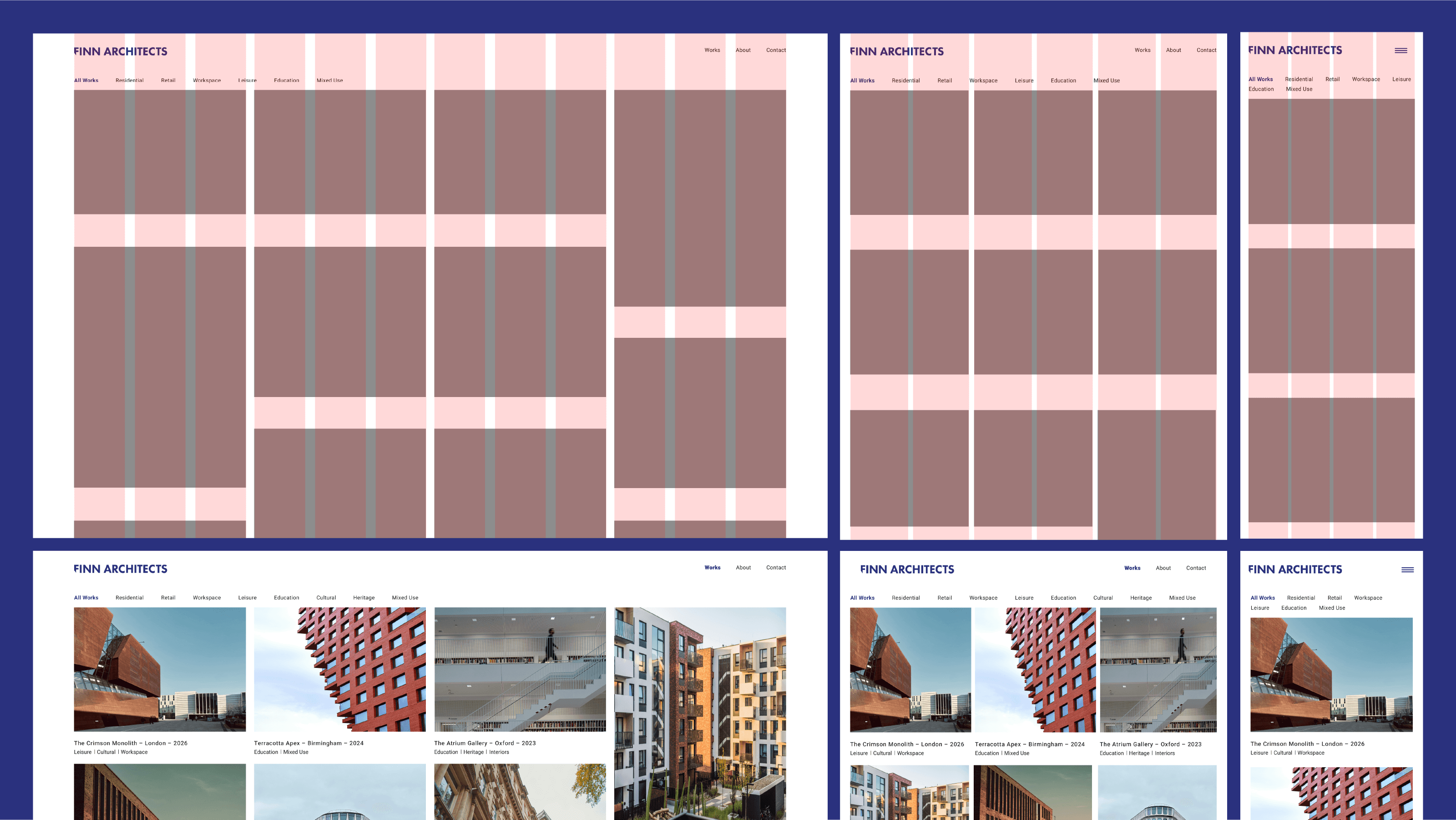
An architecture practice that looks like everyone else’s makes its work harder to remember. For Finn, the identity needed to make the studio’s thinking visible, establish a clearer market position and connect its design approach to the work itself.
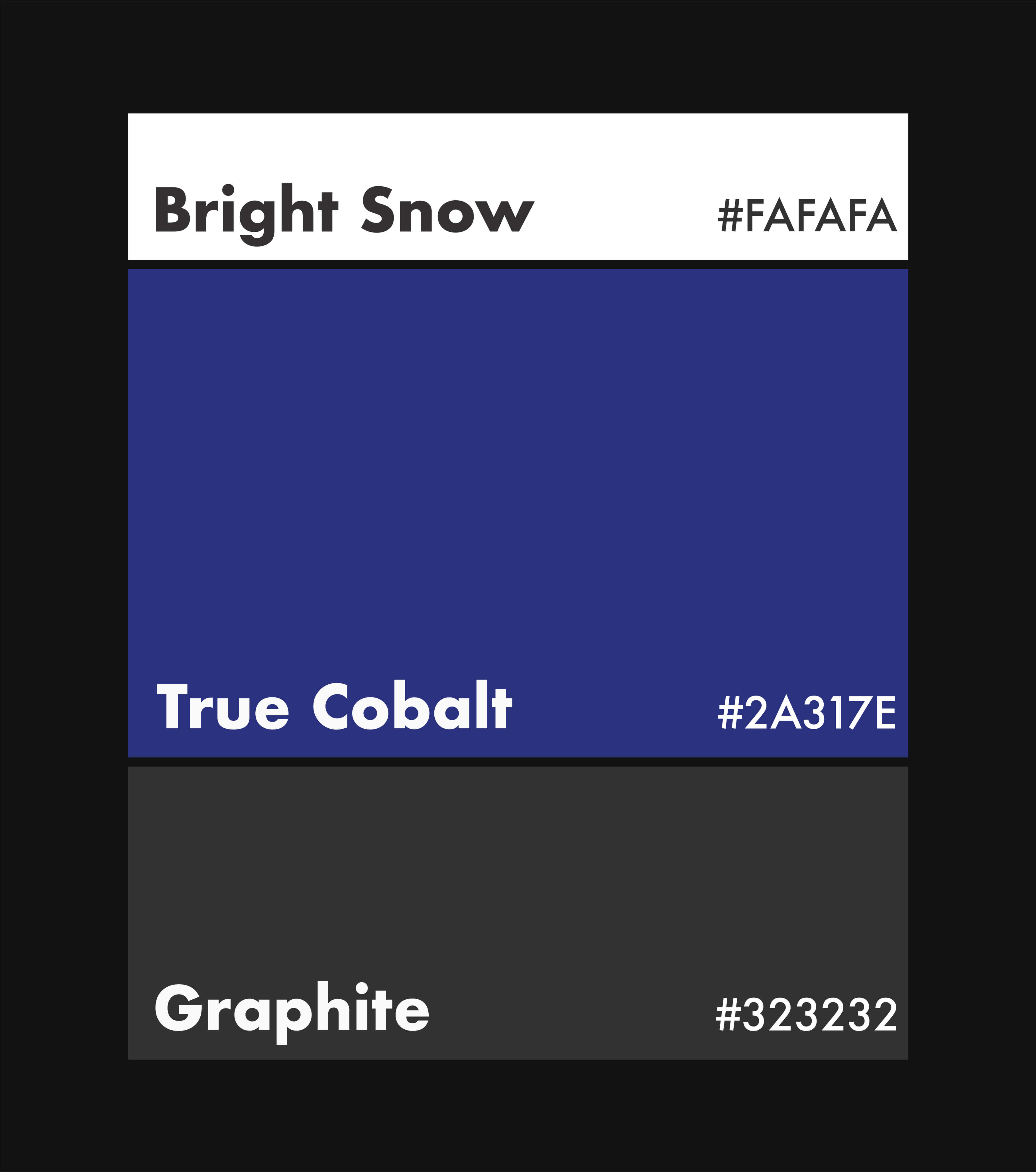
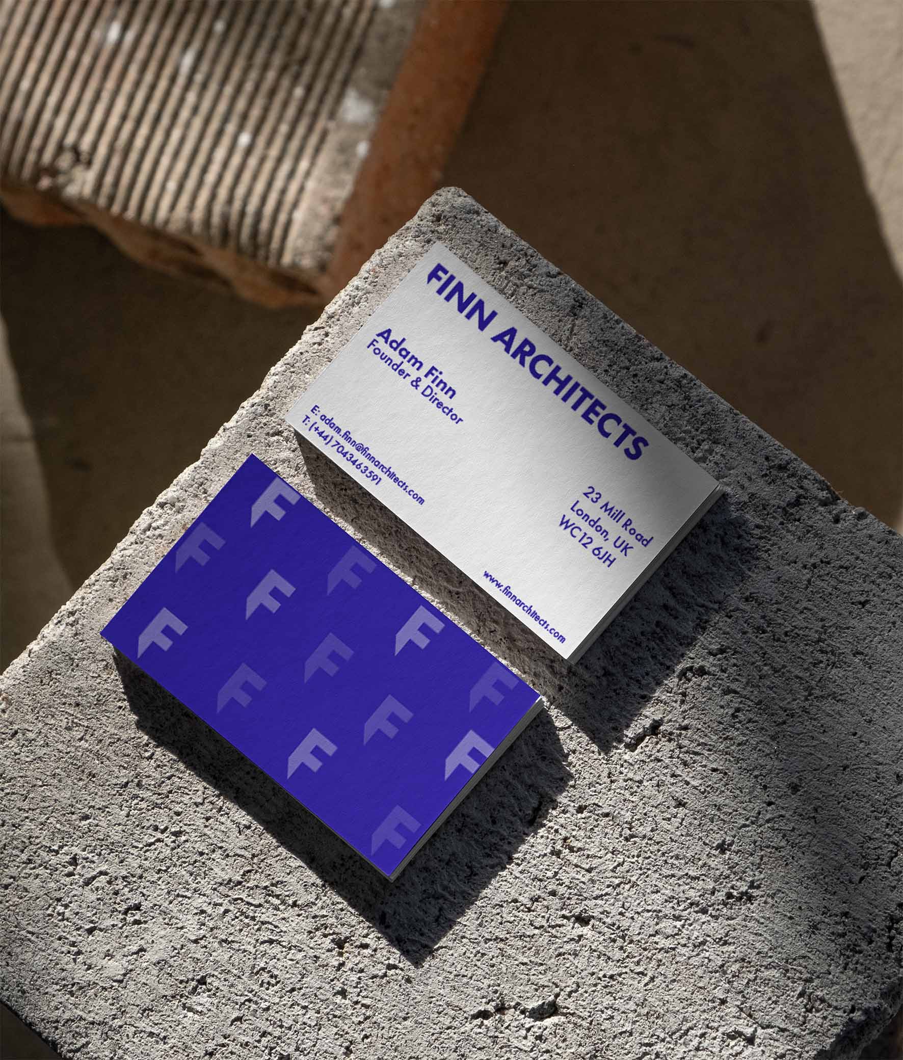
The system takes its cues from structural geometry and considered spatial planning. A heavy sans-serif wordmark, a True Cobalt and Bright Snow palette, and a repeating “F” pattern bring the identity together. Rather than relying on familiar architectural clichés, angled terminals cut into the letterforms introduce a subtle reference to rigour and precision. The result is restrained, considered and quietly distinctive.